Wednesday, 9 May 2012

Art Exhibition

25 April 2012


Newcastle College Creative Industries students have put on a exhibition downstairs, next to our studio building in Blandford Square, Newcastle.  I thought that the exhibition, though small, was very well presented in a simple but stylish way.  For a small space there was quite a quantity of work displayed and a good mix of media.

Upon entry your attention was drawn to a display which as well as being eye catching and attractive gave information about the exhibitors and I'm sure Michelle was enjoying herself more than it looks!


I really liked these screen prints especially the blue one with birds on  a wire.


This photo really made me smile, I love the way the swimming hat resembles the hydranger!
 and this shot with the tapestry shoes camouflaged amongst the tapestry rug is cute.  These two are quite quirky and I love art that evokes a reaction, these just make me smile inwardly!

This screen print reminds me of the famous Banksy picture that features a balloon but a more sophisticated less urban take on it.

These were fun and clever with very few strokes creating the face, like the pink too it somehow makes them more feminine.


These delicate ceramic cups were very pretty, I'd happily have them in my house!


This corner display works well with alot of work being shown in a relatively small corner.  The silk scarves are quirky with crocodiles on them.  The artwork on the walls is displayed beautifully in nice matching frames and placed in patterns.

Overall the exhibition did the college proud.  If my fees weren't so expensive I would happily have parted with money to take some of the exhibits home with me!


Restoration Man revisited

Wow I'm really not good at this new fangled blogging thing!  Can't believe I haven't written anything since 24 Jan....oops. Well I guess I'd better crack on with a 'potted history' of stuff I've been doing and thinking about over the last few weeks!

 Still an avid fan of the lovely George Clarke and his  'Restoration Man' programme which is on Thurs evenings at 9pm.  Though I have to say I much prefer George being a proper architect on site with his hard hat and lots of great practical solutions for good and useful use of the space, to the 'lets pretend I'm an academic' historian George that we see in some dusty old library supposedly tracing the historic context of the restoration project featured each week!

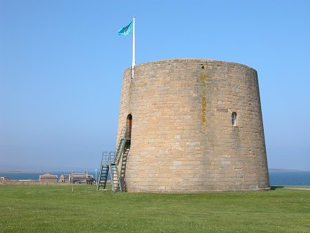
There has been a real mix of projects over the last couple of weeks, a couple of weeks ago the programme featured two towers. One a castle like turret in southern Scotland then by contrast a Martello tower ( Martello towers (or simply Martellos) are small defensive forts built in several countries of the British Empire during the 19th century, from the time of the Napoleonic Wars onwards) and generally look like this:


I have to say I'm not entirely sure why they broadcast this particular episode because both projects where a total disaster!  The martello tower was situated on the south coast and had been bought by a rather eccentric actressy lady who talked alot in a rather dramatic way.  She had purchased the tower intending to put some kind of room on the roof to capitalise on the fantastic potential views.  Sadly the planners blew her plans totally out of the water and took a hard line on this saying that there were only a few martello towers left intact in the country so although they were very happy for the existing structure to be converted to a home there was no option for putting any kind of extension on the roof.  So basically she seemed to totally lose interest and we were left assuming that the project didn't happen.  I do suspect that her motives for being on the programme may have had more to do with self publicity than a genuine interest in preserving out heritage, but maybe I'm being uncharitable..........?!

The other tower project was a like a castellated folly but another rather strange story, the previous owner was a local man that had submitted endless well thought out sympathetic schemes for restoring the castle and adding an extension in order to make it work as a home. But all of his proposals were turned down flat by the planners!  The current owner resided in Essex and used an Essex based architect to come up with several very expensive ill conceived proposals but eventually much to George's (and any one watching the programmes!) surprise managed to get planning.  The project was completed but it was the most horrific conversion!  It paid no respect to the history nature of the tower and was neither in keeping nor an attempt to contrast a very modern extension.  It looked like a couple of garden sheds had been stuck on the front of the tower, but worse than this they were painted the a pale bluemore  akin to beach huts than an historic fortress!!  The local residents were furious, it stood out for miles and looked truly horrendous!  Even George was stuck for words....bizarre..really bizarre...


Terence Conran at Marks and Spencer

I have long been a huge Terence Conran fan, I love his eclectic style and the way he mixes old and new with good design and uses unusual objects for his inspiration.  I am still hoping to catch the Terence Conran exhibition at the Design Museum in London. As a result I have for the last couple of months been admiring and lusting after the furniture range that he has designed for marks and spencer.  For more information go to  www.marksandspencer.com/Conran.  I particularly love this sofa and chair;

Product Image

Product Image

Product Image

and think that the drinks trolley above is fab! The whole range is stylish, funky and reasonably priced.  Check it out!


It's been half term this week so I've had my three children off school and family staying so we decided to take them to the Quayside in Newcastle to have a walk along the Tyne, over the foot bridge then visit the Baltic.  Always a useful place to take visitors with a nice cafe and great shop full of funky bits of bobs, good for buying gifts.  Also the views from the glass elevator and the fourth floor viewing platform are truly spectacular along the River Tyne and over the city of Newcastle.

The Turner Prize is long gone now but we all enjoyed (maybe the children slightly less so) the Andrea Zittel exhibition.


ANDREA ZITTEL

Lay of My Land
10 FEBRUARY 2012 - 20 MAY 2012
Andrea Zittel is most closely associated with the remarkable utopian structures she calls Wagon Stations which explore what humans need for survival in different ways. Zittel’s projects are deeply rooted in her own daily life and delve into architecture, painting, photography, design, textiles, needlework and cooking.

At the beginning of the last decade Zittel founded A-Z West in the remote Californian desert and began creating the 'Wagon Station' units in which everyday activities such as sleeping, eating, cooking and socialising could become artistic actions.  


Born in California in 1965, Andrea Zittel’s 
projects are rooted in everyday life. In 1999 
she moved to the Mojave Desert with the idea 
of leading an experimental life and established 
A-Z West, a site that encompasses all aspects 
of daily living as ‘an ongoing endeavor to better 
understand human nature and the social 
construction of needs.’ At A-Z West routine 
activities such as sleeping, eating, cooking and 
socialising become artistic actions. For over 
two decades Zittel’s experiments here have 
included dressing in the same home-sewn 
uniform for months on end, living on an artificial 
island and living without measured time. She is 
best known for her ‘living systems’ that explore 
the fundamental elements of human survival. 
A-Z West consists of six gradually acquired 
parcels of land. It is located in an area where, 
from the 1940s to the early 1970s, the US 
Government gave people five acres of land 
under the Homestead Act as long as they 
could improve it by constructing an inhabitable 
structure. Today, the result is a seemingly 
infinite grid system of dirt roads and tiny, 
largely abandoned, shacks. 
Crochet
Zittel’s crochet works explore one of the 
fundamental principles of her practice: the 
possibility of freedom born from limitations. Each 
work is based on a specific self-imposed rule 
system that dictates the final form. Clasp 2010 
was made by making ninety-degree turns and 
three stitches in any given corner. The Bodily 
Experience of a Physical Impracticality 2010 
is a starburst of incremental units. The works 
have a contrasting relationship. Clasp holds like 
an embrace while The Bodily Experience of a 
Physical Impracticality evokes the body moving 
through space and is reconfigured each time 
it is shown. 
Raugh Sculpture
The Raugh (raw/rough) liveable sculptures are 
furniture modules that were also developed 
from the idea of freedom within limitation. Like 
Zittel’s crochet, these objects are built with 
strict organising criteria. The Raugh system 
plays with the idea of natural order. Zittel 
believes that things belong most naturally 
in the environment in which you place them.  
She sees the Raugh Bookshelf 2006 as an 
‘energetic accumulator’ that sucks life onto 
its surface. The Raugh sculptures adapt to 
domestic disorder and to the accumulation 
of dirt. The user is central to the functionality 
of the work and the customisation of the basic 
modules is an integral part of the process.
Wall Sprawls
The Wall Sprawl works are created using satellite 
images of uninhabited land that is starting to be 
developed. The images reveal the cultural context 
of the American Southwest and challenge the 
popular notion of the desert as a wilderness. 
The reality is a rapidly developing, complex and 
politicised space – its resources are exploited 
by the US Military and it has the fastest growing 
population in the United States. Wall Sprawl #2
(Las Vegas between Enterprise and Henderson)
2011 draws attention to the fringe areas that lie 
between the desert and large-scale development. 
Its pattern reveals different time periods, agendas 
and economic systems: expensive developments 
have organic forms, while cheaper developments 
follow rigid grid patterns. The use of repeated 
patterns, tiling and mirroring in the work echoes 
the sense of never-ending sprawl.
Lay of My Land 
In contrast to the Wall Sprawls, Lay of My Land
2011 emphasises the fact that the landscape 
has been divided into arbitrary sections and 
reveals a collision between natural geography

and man-made systems. Here, Zittel focuses 
on the concept of the parcel map, which 
superimposes a man-made system of 
measurement and distribution onto the land.
In practical terms, this historical process of 
division means that Zittel is not permitted to 
build across the boundaries between adjacent 
parcels of her own land. Zittel’s house, studios 
and a number of Wagon Stations are visible 
in the topography of this work. 
Wagon Stations
The Wagon Stations have sat on one of the six 
parcels at A-Z West for eight years. Close to 
destruction by the elements and the hostile 
desert environment, they have been relocated 
to a gallery setting at the end of their functional 
lives. The units were developed as part of 
Zittel’s High Desert Test Sites project to 
accommodate visiting artists. A station wagon 
was the smallest thing Zittel could imagine 
safely sleeping in; the Wagon Stations 
developed from this idea. It had to be possible 
for the structures to both withstand the 
elements and be small enough to be built 
without the need for permits. These 
requirements and restrictions have informed 
their design – the curved shape and leg 
supports allow the wind to move around them 
and their size is just sufficient for two people 
to sleep inside. They can also be locked and 
secured. The Wagon Stations offer a limited 
space that allows the bare essentials for living. 
Zittel wanted to experiment with living systems 
that could be left open for modification and 
customisation by those that inhabited them. 
All of the units in this exhibition have been 
customised by the people who used them
and made them their personal space over time. 

Studying interior architecture and exploring the efficient and best use of space this exhibition was of some interest to me.  Though in her experiment Zittel focuses on survival and the use of her specifically designed wagons, exploring the bare essentials required to exist in this case in the desert.  In this situation 'space' itself to reside in becomes a bit of a luxury.


Edinburgh trip to see the pandas!


On our trip to Edinburgh to visit the pandas (rather frisky by the way) at the zoo we decided to take a bit of a detour to get a bit of retail therapy. Much to my childrens disappointment we found ourselves enjoying the charms of Anthropologie, we also visited the Regent Street storein London the week before!  For the uninitiated Anthropologie is the more grown up, slightly more sophisticated and considerably more expensive sister company of the Urban Outfitters chain of shops.  Aimed at middle aged ladies it has very lovely clothes and stocks proportionally more housey stuff like Urban Outfiitters it is presenting us with a 'lifestyle'.  It is full  lovely tasteful but expensive stuff! The shop fitouts are simillar in terms of having an urban feel, using the character of the period building as features but anthropologies stores are less edgy and more classy presumably  to appeal to a more grown up market.

Anthropologie ( Edinburgh)

Light well at the front of the store viewed from the basement.

Anthopolgie ( Regent Street, London)

Stairs down to the basement with exposed original  construction.
Explanation of the living wall
The Regent Street store features a 'living wall'!


Liv and Bella on the open stairwell to basement retail.


Interesting display of furniture!  These chairs ARE for sale.


Jack Wills (Edinburgh)


Rows of lovely roof lights bring a lot of natural light into the rear of the store.  The period feel of the building suits the  tradition british, public school style of Jack Wills image.  The spectacular chandelier fits well with the period style of the ceiling and salvaged timber floor.  The fit out reflecting the lifestyle image of the merchandise being sold.

 Paperchase ( Edinburgh)


The shop fitout uses simple modern panelling almost as a shell within the deteriorating  fabric of the period building it is situated within.  Clever use of contrast of the smooth lines of the fit out and scruffy historic nature of the shop itself.

 Modern light fittings and modern coloured and white panels contrast the  exposed brick wall along the left hand side of the shot.